Thanks for your input! Looking forward to seeing the brand guide take shape.
Hereby the votes from a colourblind cartographer:
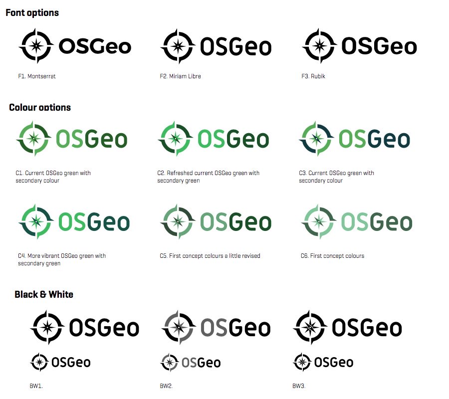
1. Font:
- the Miriam Libre is by far the most distinguishing & catchy one, and
therefore fits best with the freshness that I hope is one of our key values
- and a font with "Libre" in it's name definitely has a "plus" 
2. Colo(u)r:
C5 is the best color combination: a fine constrast between the two colors,
not too much (as in C1 - C4, not too bleach (as in C6)
3. Sub-brands:
A good point for discussion!
When speaking to my fellow Dutch board member Marc yesterday, for a moment I
got the impression that local chapters are supposed to simply write their
chapter name below the standard logo, and that's about it.
Fortunately it became clear to me that OSGeo.org and it's local chapters are
"loosely coupled", which is another key value of our organisation.
Thus, I suppose the challenge for the local chapters is too grab the new
OSGeo logo, pick some key elements (color, font, grapghics) and use that as
a base too create a fresh new local logo.
For OSGeo.org committees it's arguable to simply sticks to the standard logo
and write the name of the committee below it (as in the supplied examples:
PDF)
4. Compass size:
No particular preference.
The detail I appreciate most is the slightly left-of-center-ness of the
compass needle
Wonder if the marketing committee is about to hire a tattoo artist at Foss4G
in Boston to supply the entire community with the new logo
Kind regards from the city where cartography had its heyday,
Gert-Jan
Van: Marketing [mailto:marketing-bounces@lists.osgeo.org] Namens Jody
Garnett
Verzonden: donderdag 11 mei 2017 20:42
Aan: Marketing Committee
Onderwerp: Re: [Marketing] branding wrap up
I cornered Julie West from Boundless for another "coffee break" chat:
F3 Rubik
C3 Current OSGeo green with secondary color
BW3
Here are the notes:
Font
Like F1 the most, G does not have "bar" so may look like a C
Is F1 the same as QGIS Font choice?
F1 "O" so similar to compass, discussion on QGIS approach of folding into
text (not interested)
F2 - the font says "libre" how can that be a bad thing, membership would
like this 
F1 and F3 the most, F2 is a little narrow, skewed, too tall
F1 and F3 weight is better
Jody likes the F3 weight the best
Jody: Likes all three of them
F3 happy medium, has the bar for "G"
Like F3 the most
Jody likes F3 the most
aside: Discussion on "OSgeo Green color"
C1, C2, C3 --> C3
C3 has more contrast with secondary color
C3 is clear winner
C4 bright? secondary is toned down ,more similar to C2
C5 more contrast
C6 is too light on both colors
Sub-brands
C1 looks okay like this, nice and clear
Subrand is in the same font
Going with Rubic woudl like to also keep both the same
looks good!
Compass size
S2 is better
still looks pretty clear when small
Black and white
Appreciate two grays in BW2! A bit hard to see the difference
BW3 steals the show
love the white space in BW3
Context
looks great with all of them
looks better than some of the others!
--
Jody Garnett
On 11 May 2017 at 11:37, Jody Garnett <jody.garnett@gmail.com> wrote:
Out of yesterdays meeting we have a PDF to review showing:
- 3 font choices
- 6 color choices
- 3 black and white options
- 2 compass sizes
During the meeting we felt all the options were pretty good, and were happy
to be guided by get interactive designer.
I have shared the PDF in the board meeting (response ways "great" and "trust
the designer don't ask us" as you may expect).
This email is an invitation to review, I will respond shortly with my own
take.
--
Jody Garnett
_______________________________________________
Marketing mailing list
Marketing@lists.osgeo.org
https://lists.osgeo.org/mailman/listinfo/marketing