All, in our OSGeo-Live weekly meeting today [1] we discuss a new OSGeo-Live logo and came to the conclusion that a "Play" logo would be a good way to convey what we stand for. (OSGeo-Live allows people to run OSGeo applications). While a traditional play logo is a right pointing triangle in a circle, we were thinking we could put a right pointing logo inside the outer ring of the OSGeo logo (replacing the inner star).
This would address our goal of being tied to OSGeo, but also linking to our project attributes.
Is this something that people in the marketing committee would consider acceptable? (Hopefully so, as a prior suggestion from the marketing committee was similar - putting a heart in the middle of the OSGeo ring).
Warm regards, Cameron
[1] http://irclogs.geoapt.com/osgeolive/%23osgeolive.2017-08-28.log
On 28-Aug-17 2:25 AM, Jody Garnett wrote:
What we did in the style guide is be clear about what is going on:
1) osgeo mark and logo
2) sub brands - use the osgeo mark with different text (two presentations are available to allow of OSGeo:UK style)
And then:
3) distinct brands - use their own mark. Distinct marks are able to use the color and fonts and some branding elements to be visually part of OSGeo (but because they use their own mark they are forming a distinct brand)
We have used GeoForAll and OSGeo Live as examples of distinct brands.
This was a case of us not being familiar with the terminology around branding, hopefully armed with the above breakdown it will be easier to explain.
We went back with the graphics designer multiple times learning more each meeting. This produced things like the OSGeo:UK alternate text for a sub brand, and experimented with a few examples of distinct brands. We also have some unknowns, specifically what to do on twitter and facebook for avatar pictures for osgeo local chapter feeds. We would like to use the osgeo mark unaltered but the format does not allow for that and the circle avatar design target limits options (it is intended for a face after all).
Please have a look at page 5 of the style guide at the top of this thread.
See page 5 here -
https://github.com/OSGeo/osgeo/blob/master/marketing/branding/styleguide-osgeo.pdf
<https://github.com/OSGeo/osgeo/blob/master/marketing/branding/styleguide-osgeo.pdf>
From the marketing committee perspective we have as you say "just invested in a professionally developed corporate identity, logo and guidelines". It will take a bit of hand holding, and some tradeoffs, as we explain options to projects, local chapters and committees.
With respect to this weeks meeting we should focus on the website site map gap analysis, prioritizing the outstanding issues (whole sections of the website do not work yet), and complete the contract with Get Interactive in a timely fashion. I would not feel good about going back to the sub brand handling for a forth time. Several groups had a chance for direct 1 on 1 during the code sprint and we should move on to finishing this project.
By the same token we are iterating on the choose-a-project graphics; while I was able to offer some clarifications during the code sprint I would really applicate some backup by someone with more cartographic & analsyis experience then me. In many senses I am just a developer and we need input from someone with more experience of our target audience than I can provided.
--
Jody Garnett
On 27 August 2017 at 01:52, Steven Feldman <shfeldman@gmail.com <mailto:shfeldman@gmail.com>> wrote:
We have just invested in a professionally developed corporate
identity, logo and guidelines. I disagree with Cameron (doesn't
happen often) on allowing a high degree of flexibility in the user
of the logo and interpretation of the guidelines.
Let's try to follow the guidelines as closely as possible - use
the logo as intended or continue with a project specific logo and
have a small OSGeo logo separately, don't change the logo colours.
Let's note any problems we encounter and review after a year
Steven
> On 26 Aug 2017, at 21:00, marketing-request@lists.osgeo.org
<mailto:marketing-request@lists.osgeo.org> wrote:
>
> Send Marketing mailing list submissions to
> marketing@lists.osgeo.org <mailto:marketing@lists.osgeo.org>
>
> To subscribe or unsubscribe via the World Wide Web, visit
> https://lists.osgeo.org/mailman/listinfo/marketing
<https://lists.osgeo.org/mailman/listinfo/marketing>
> or, via email, send a message with subject or body 'help' to
> marketing-request@lists.osgeo.org
<mailto:marketing-request@lists.osgeo.org>
>
> You can reach the person managing the list at
> marketing-owner@lists.osgeo.org
<mailto:marketing-owner@lists.osgeo.org>
>
> When replying, please edit your Subject line so it is more specific
> than "Re: Contents of Marketing digest..."
>
> Today's Topics:
>
> 1. Re: [Live-demo] osgeo live logo, and website presentation
> (Cameron Shorter)
>
----------------------------------------------------------------------
>
> Message: 1
> Date: Sun, 27 Aug 2017 04:03:56 +1000
> From: Cameron Shorter <cameron.shorter@gmail.com
<mailto:cameron.shorter@gmail.com>>
> To: Angelos Tzotsos <gcpp.kalxas@gmail.com
<mailto:gcpp.kalxas@gmail.com>>, Jody Garnett
> <jody.garnett@gmail.com <mailto:jody.garnett@gmail.com>>
> Cc: "live-demo@lists.osgeo.org
<mailto:live-demo@lists.osgeo.org>" <live-demo@lists.osgeo.org
<mailto:live-demo@lists.osgeo.org>>,
> "marketing@lists.osgeo.org
<mailto:marketing@lists.osgeo.org>" <marketing@lists.osgeo.org
<mailto:marketing@lists.osgeo.org>>
> Subject: Re: [Marketing] [Live-demo] osgeo live logo, and website
> presentation
> Message-ID: <9783ae77-d3c3-9779-0e96-e821c92bbe93@gmail.com
<mailto:9783ae77-d3c3-9779-0e96-e821c92bbe93@gmail.com>>
> Content-Type: text/plain; charset="utf-8"; Format="flowed"
>
> Jody, others,
>
> Looking at the branding style guide, there is some ambiguity
between the
> goal of allowing sub-brands (which would involve being creative
with how
> the logo is used with other graphical concepts) and dos and
don'ts which
> state not changing the logo. I suggest Dos and Don'ts be
suggestions and
> goals rather than hard rules in order to enable people to be
creative.
> Eg: if a chapter wanted to use their country's flag colours
within the
> logo, I think that should be ok. It is in the designer's
interest to try
> and align with the core OSGeo-Logo, so they will likely do a
good job of
> making it obvious there are OSGeo roots.
>
> Eg: Spanish logo:
>
https://wiki.osgeo.org/wiki/Capítulo_Local_de_la_comunidad_hispanohablante
<https://wiki.osgeo.org/wiki/Capítulo_Local_de_la_comunidad_hispanohablante>
>
> For OSGeo-Live, I'm expecting we will want to work out a way to
weave a
> heart (or some other image aligned with "live") into the logo
somehow.
> We may want to retain the blue heart. That should be ok and up
to us to
> do a good job of deciding that.
>
> You might notice OSGeo-Live has broken the style guide by using
the logo
> in over another image in our screenshot:
>
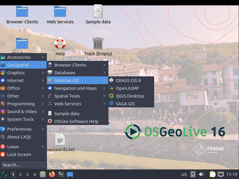
> https://live.osgeo.org/_images/osgeolive_menu.png
<https://live.osgeo.org/_images/osgeolive_menu.png>
>
> In previous releases we have used washed out versions of the
logo, of
> large, off-center parts of the logo. It was artistic and looked
good,
> and provided the link back to OSGeo. We should empower the creative
> people in our community to be creative in that way.
>
> The guide is prescriptive about only being shown on a white
background.
> Again, that should be a recommendation rather than a rule. If I
have a
> presentation template with a light blue background, I should be
able to
> put a logo over the top, without needing to create a white
square to put
> under it. As a creator, I should be able to decide which looks best.
>
> Cheers, Cameron
>
>>
_______________________________________________
Marketing mailing list
Marketing@lists.osgeo.org <mailto:Marketing@lists.osgeo.org>
https://lists.osgeo.org/mailman/listinfo/marketing
<https://lists.osgeo.org/mailman/listinfo/marketing>
_______________________________________________
Marketing mailing list
Marketing@lists.osgeo.org
https://lists.osgeo.org/mailman/listinfo/marketing
--
Cameron Shorter, Software and Data Solutions Manager,
Jirotech Pty Ltd,
Suite 112, Jones Bay Wharf, 26 - 32 Pirrama Rd, Pyrmont NSW 2009
P +61 2 8099 9000, M +61 419 142 254, W www.jirotech.com
P +61 2 8099 9000, M +61 419 142 254, W www.jirotech.com